
overview
Carnegie Mellon is a world-renowned university that attracts some of the smartest and hardest working students from everywhere in the world. Applications are the main interface through which most prospective students will engage with CMU and, likewise, how administrators will engage with said applicants. This single point of contact is essential to CMU continuing to admit the best and brightest; however, the current system is not supporting the administrators as well as it could. The School of Computer Science contracted us to analyze and redesign the administrator-facing side of ApplyGrad. Over the course of just six weeks, we learned how administrators use ApplyGrad, conducted a heuristic analysis to identify the most critical issues, and iteratively designed and tested new screens, culminating in presentations to the School of Computer Science steering committee and Master’s Heads.
problem
Through heuristic analysis and contextual inquiry, our team identified and prioritized opportunities in the ApplyGrad system to answer the question: How might we redesign ApplyGrad to better support administrators’ workflows?
We learned early on that not only is ApplyGrad not supporting administrators’ workflows, it is causing them to adapt their mental models to even be able to work within the system. This became the main issue to solve through our redesign, and we mapped the question to three main areas for improvement:
ApplyGrad’s landing page shows all three sections in one place—application, evaluation, and admission—causing administrators to change their model of the process to match the system.
Admissions is a sequential process but Applygrad does not support this model
The current ApplyGrad system presents administrators with a homepage that offers lists of tasks and options for all three stages of the admissions process in one place. However, we learned from administrators that they rarely need to access more than one set of tasks at a time. This is because admissions is a linear, sequential process; at any given point in time, only one portion of the process is “active” and thus requiring attention. Having all tasks and options available at all times only served to overwhelm administrators. By introducing navigation and separating application, evaluation, and admission into their own pages, we cut down on information overload and helped match the system to administrators’ models of the admissions process.
Rather than supporting administrators, applygrad is actually creating more work
Administrators we spoke with told us that a large part of their engagement with ApplyGrad involves finding and compiling data about the status of the admissions process; that is, answering questions like “How many applicants do we have this year compared to last year at this time?” or “How many applicants are missing parts of their application?”. ApplyGrad contains this information, but does not make it readily available, instead forcing administrators to dig through lists and compile the information on their own. Not only are administrators having to seek out these data, but they also reported using external spreadsheets in order to compile and compare them. The system was not built to support this heavy use of data, which causes administrators to swivel between ApplyGrad and their own spreadsheets. Not only is this exhausting, it also increases the likelihood of human error by forcing administrators to touch every data point.

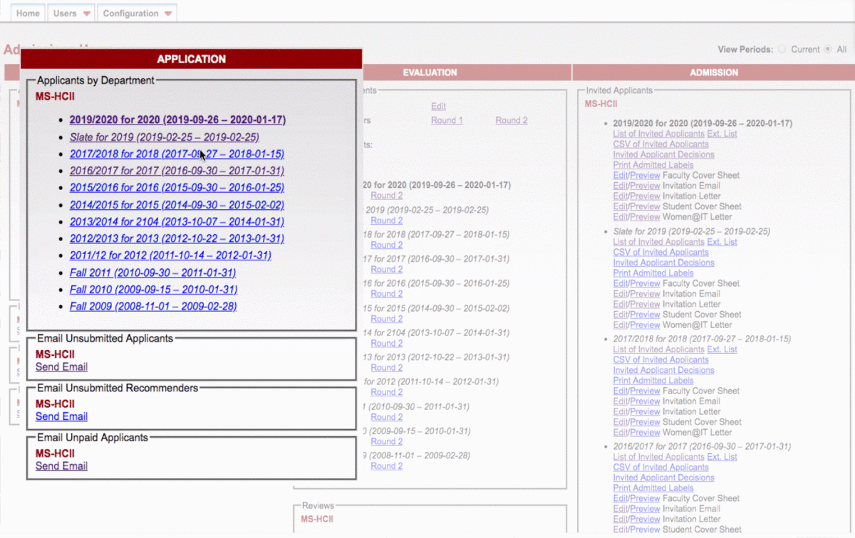
Links are small, close together, and virtually indistinguishable, contributing to overwhelm and confusion for administrators.
ApplyGrad lacks clear and useful information architecture, causing stress and overwhelm
When talking with administrators, they often clicked on incorrect links or had to search very carefully to show us their process. Not only does ApplyGrad tax administrators by forcing them to adapt to an inflexible system, the visual design lacks clear hierarchy, coupling, and progressive disclosure, instead presenting options with uniform sizing and color with minimal spacing. This left administrators unable to easily find what they needed on a screen with many options.
solution
Once we identified the main opportunities for improvements in ApplyGrad, we began designing. Early iterations were done individually by team members in order to ensure an array of design ideas that we could adapt and utilize. Our final design addressed the opportunities we identified through our research.
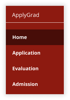
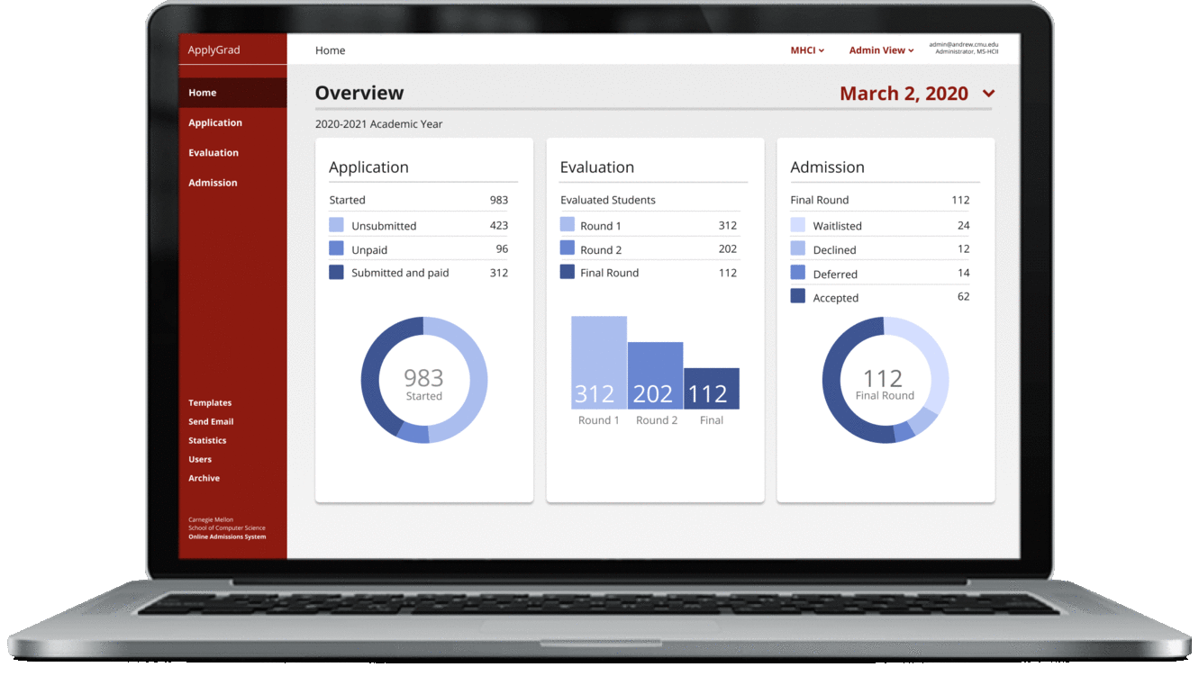
Admissions is a sequential process; to help the site match administrators’ mental models, we introduced navigation tabs and separated the three sections (application, evaluation, and admission) into their own pages. We also added a main landing page with a high-level summary of data to provide a consistent entry point into the platform.

We learned from administrators that much of their interactions with ApplyGrad involves finding and compiling data for reporting on the status of the admissions process. We designed pages that surface these data in the form of summaries, shown in both data visualizations and in large, easy-to-see numbers at the top of some pages. Administrators were delighted with this design, stating, “I would find [data summaries and visualizations] very useful, but wouldn’t have thought to ask for it.”
Finally, by introducing visual design cues like hierarchy, progressive disclosure, and coupling, we were able to cut down on the overwhelming feeling of looking at the current ApplyGrad landing page. In this way, not only are administrators able to find what they need more easily, they also enjoy the way the design looks.

process
Contextual inquiry
Our first goal in this project was to meet with a power user who works in admissions every year as both an administrator (assigning applicants to reviewers, monitoring incoming applications, and administering decisions, among other tasks) and a reviewer. We spent two hours with this user, learning her process and and trying to understand how she spends her time working in the application. We learned a great deal about the workflow of users in the application. Particularly, we were very surprised to learn that much of the work actually happens outside of the platform, where she keeps spreadsheets of information throughout the application process.
Heuristic evaluation
The team performed individual heuristic evaluations using a test environment of the application and referring back to the contextual inquiry we had performed initially. We knew that between the five of us, we should be able to catch a majority of issues. We came together as a team to discuss what we’d discovered individually and what we felt the severity of the issues was. We identified eight themes in our evaluations, many of which had in common that the issues increase cognitive load on the user. We saw this in the interface not meeting general user interface conventions or design standards, overwhelming users with information that is often unnecessary based on where the user is in the applications process, and forcing the user to adapt their mental model of the admissions process to the workflow afforded by the web app.


Impact/effort & card sorting
We began this leg of the project by creating an impact/effort matrix as a team. We coded themes and individual points under each theme and organized them on our matrix as a group, estimating the effort and impact. We met with the development team and our initial power user, presenting what we created after our heuristic evaluation in order to solicit their thoughts on the difficulty required to implement our recommendations and the impact that addressing particular issues might have. This helped the team better understand where focusing our efforts would offer the most value with the least effort on the part of the development team (of only 2!).

After we understood impact and effort from the perspective of our power user and development team, we conducted a card sorting task with our power user. We wanted to understand which functions and tasks contained within the application are the most useful for her and which are less important. This helped us in forming our initial designs as we had a clearer idea of the most useful functions that should remain visible most of the time and which functions could be contained in separate pages.
initial designs
The team split up designing our first screens as we knew we wanted to run A/B tests with our power user and other administrative staff in the School of Computer Science who have similar (but notably different) workflows. We wanted to both validate the solutions we ideated as well as understand how our designs fit with differing workflows. We heard early on from our users and the development team that tasks and workflows differ between programs and levels (Master’s vs. Doctoral) in SCS.
The team discussed which of our eight themes and which issues contained therein we felt were approachable for the very short timeline we had and which were likely to require more team either in developing a solution or that would require some more sweeping restructuring of the web application. As you can see below, we were able to prioritize what we felt were the more pressing, easier-to-address, shorter-term issues. We also made note of those issues we felt would require more time to address, but that we would be able to provide recommendations on for the development team and any other student team that may pick up the project after us. We wanted to address issues of text & visual hierarchy, list styles that are inconsistent both internally and with conventional lists, bulk actions not being allowed, feedback being inconsistent or non-existent, and a lack of progress tracking. These seemed to us to be both impactful according to our user and within the scope of our timeline.

We split up again to explore designs we could put in front of users to determine the value of solving the problems we identified. At first, we designed the above smaller pieces (a list, some feedback, what progress tracking and bulk actions might look like), then incorporated those into screens based on sections of the site. Dividing design work made the most sense to us as three main sections for the tasks involved in the process (applications, evaluation, and admissions) as well as a more general landing page. We felt that this structure in and of itself addressed some of the issues from our analysis, such as the current site overwhelming users with irrelevant information on a single, cluttered landing page.
Our initial designs were focused largely on how we might reduce cognitive load on users while working through the admissions processes from the faculty/administrator side. We knew that users likely would not need access to functions in different sections of the site (applications, evaluation, and admissions) at the same time, as the admissions process is largely linear and repeats almost the same timeline every year. For this reason, we quickly agreed that grouping and “hiding” functions and tasks associated with each section would be valuable in allowing users to focus on the specific section they’re concerned with at a given time of the year. We also wanted to provide users a way to see important congregated data at a glance to allow for progress tracking and comparisons to previous years’ admissions processes.
a/b testing
Our A/B tests revealed a lot of useful information from the users we tested with across programs in the SCS. Some of are key findings were:
Users had a strong positive reaction to our creation of a singular, dashboard-style home page where they can get a quick view of relevant data based on which admissions processes are active at that time of year.
Being able to easily look at previous dates (usually the same date in the previous year) was also communicated as very important, as administrators are often asked to compare data from the current year with previous years.
We presented a timeline view with some functionality in an initial design that, while it received mixed (although generally more positive) feedback, we decided to leave out of future iterations, as it presented potential development issues and users reported a preference for clear lists of data and visualizations.
We also presented users with “favorites” in different forms, but ultimately found that reception was mixed and we felt that by improving on the workflow to match users’ expectations, we could simply remove the need for “favorites” or “quick links”.
We heard from users that, “A lot of what we do is data-driven; faculty and program managers want to know where we are compared to last year, whether that’s valuable or not.” When testing some of the features we had implemented in our redesigns, users also reported, “I would find this feature extremely useful, but I wouldn’t have thought to ask for it.”
final designs
Through our A/B testing, we were able to identify what features users found most valuable. We iterated on the designs and developed a style guide in order to both standardize our designs and to ensure consistency and avoid any confusion for the development team during implementation. We feel that in such a short timeline of approximately 5-6 weeks, we were able to quickly and effectively identify the biggest issues and pain points in the application, gain insight into what users needed, redesign the interface to better match with users’ mental models of applications processes, and gather validation for what we designed.